Naka Muay Thai
Project Manager
2022—23


Brand Design (NakaMT BrandBook VF)
Below: Brand_development V1

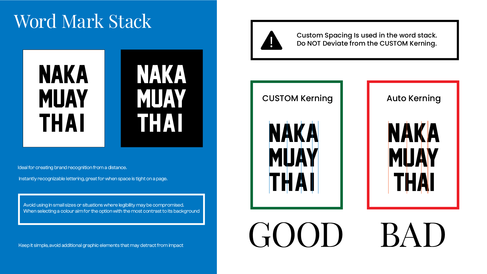
Created in InDesign, optimized for print to maintain consistency in posters and announcements. I.e.: fight night promotion, schedule changes, etc.
This was amended for digital versatility by the second draft.

V1 consisted mainly of element guidelines and early brand development.
Brand Book
Vf, used in the development of the final version, optimized for web.

Product Prototyping
Proposed Updated Sitemap:

 Findings of Competitive Product Audit

Disjointed Online Presence (updated)


Above: An alarming find was immediately shared with stakeholders: not only were there multiple pages on the same platforms for the gym, but the descriptions were also often incomprehensible, misleading of our offerings, or poor quality.
 Above: Artboard in pitch deck presented in audience-friendly language
Below: Presentation Artboard

Below: Scope creep of social media marketing and market research. Preliminary structure for a content strategy and online presence. In the future I would have loved to have continued development of Ajahn’s and Naka’s online persona through short content, skits, psa’s, and more creative advertising productions.

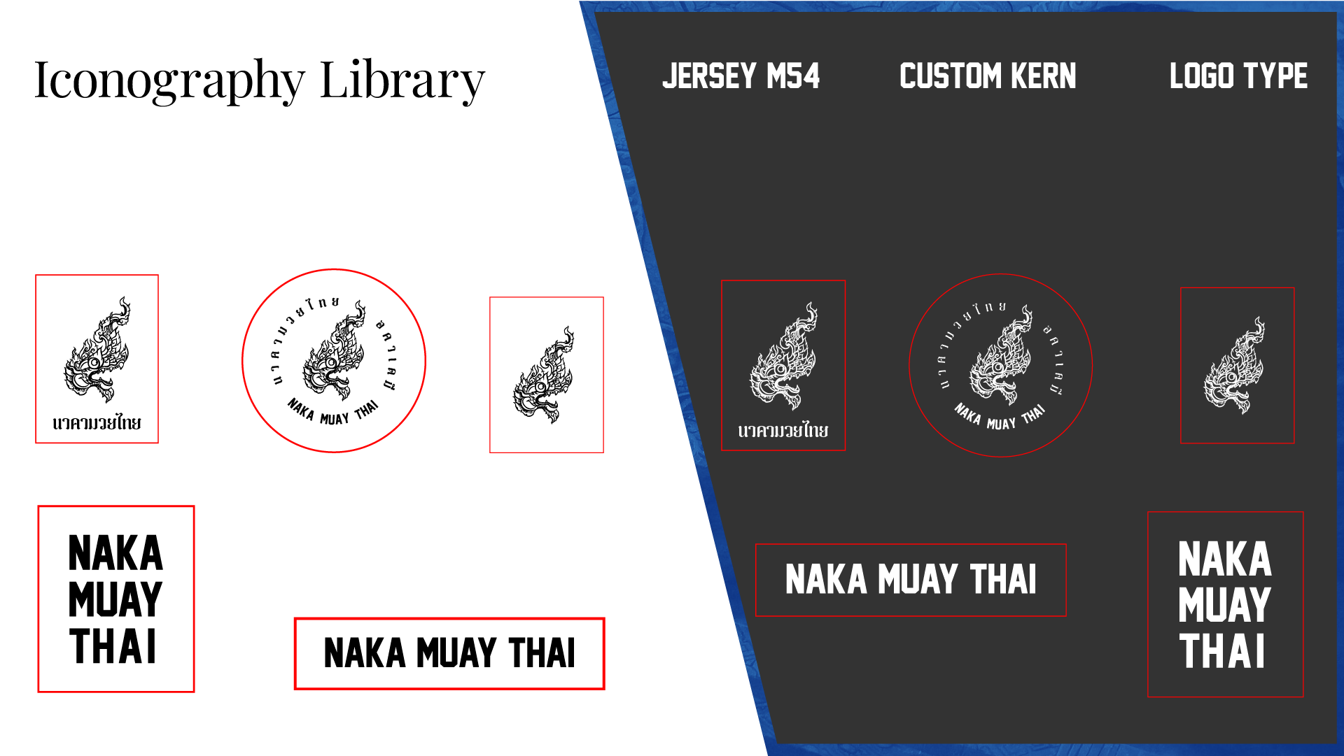
 Above: Iconography Library in .svg formats and suggested spacing.
Below: Actionable next steps outlined to meet goals.
Intro
Ajahn Amnat was my first muay thai coach. He reminded me of someone. .I began work on this project as a parting gift. I wanted him to be discovered easily with fewer interruptions, and drive more customers to his business. Here is my process.

Brand
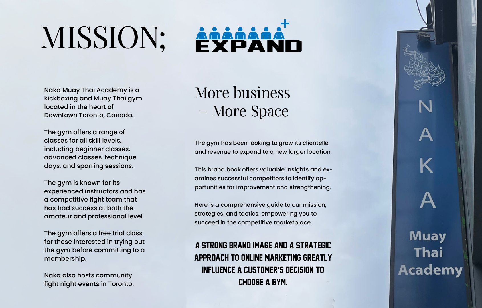
A brand is a story, I knew Ajahn from our time together. Hailing from Bangkok, He began fighting at the age of seven to feed his family like many other Thai children.He is a battle-tested master, revered within his gym, and a personality in the local community. His personality, his gym.
I believed in creating a unified visual identity and brand personality. I built upon Naka's strengths, aligning the brand with his unique attributes.


Product
I I designed low-fidelity and high-fidelity website prototypes in Adobe XD and built wire frames.I self produced the brand assets and designed desktop and mobile


Playing to my strengths, I was developing a product prototype in xd & Figma. I suspected it was not the most urgent pain point for user discovery and driving foot traffic. Along the way of wireframing and HI-FI development, it became apparent the current offering was sufficient and even superior to competitor offerings.
Continuing this project in a meaningful and impactful way would mean changing the active communication first. I paused the development of his website.
Competitive Audit
A comprehensive competitive analysis confirmed the need for immediate change in approach. Competitor analysis of social media platforms, design, communications, locations, and unique offerings.Pictured below: Excerpt from competitive audit


The results indicated that one of the most harmful forces affecting the business was the disjointed online communication and presence of the gym.

I was so vocal about brand consistency. Ajahn posed a genuine question which formed pivotal shift in my thinking, all the way over, from product to user.
Presentation Artboard for Ajahn

To be successful, I needed to know how my user; Ajhan. I would need to create and teach Ajhan about what I was doing for it to meaningfully reach him.
User Personas
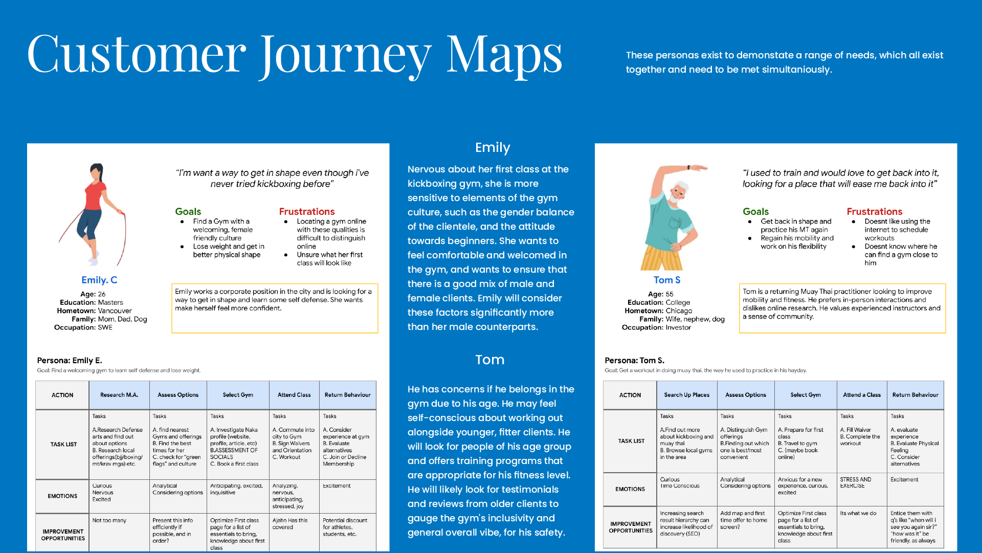
I’d spent months passively collecting information about the consumers at Naka in the community, and people considering trying Muay Thai. I began collecting data and personifying cases, creating user personas. I framed clear motives and sensitivities, reflecting feedback of genuine people. Journey Maps
This stage helped to visually present the journey to becoming a customer at Naka, broken down into stages. I identified sensitivities and pain points unique to users and shared them across profiles to demonstrate where and when customers become discouraged along the way.
Below: Customer Journey Maps and User Persona cases to personify the search process of Naka’s offering. Instrumental in communicating to stakeholders where a priority lies and it’s greater impact.


Actionable Recommendations
To accomplish the primary goal of growing our gym clientele, I reached Ajahn. One of the most powerful tools in the study was the user personas and journey maps that demonstrated the impact of lengthening the discovery time for more information. Developing a strong digital presence with coherent messaging was a priority. Ajahn had renewed confidence in manageing his channels and create branded content for Naka.
While I was disappointed that I couldnt implement the strategy myself, I’ll always appreciate the development he helped me achieve during my time with him.
Below; a promotional sister brand identity development.

Scope Creep
The end product changed during this project because it required research investigation at the beginning of the project to determine the most effective method to grow Naka. The competitive analysis, user research, product evaluation, and UX process were instrumental in developing a clear and actionable plan to implement. I planned extensions, including a sister promotions brand for Naka’s live events and a comprehensive media strategy.
Below: More branded artboards from presentation, Parameters

Take Aways
I completed this project by taking on multiple roles, however I strongly believe in the power of multiple perspectives. I would love to direct this project with a budget in the future.Full Presentation
My full presentation available for him to view here︎. strategy, user experience design, brand development, product prototyping, live promotion